Projecting an image to win Kickstarter: Part 1
The world still kinda sucks, let’s keep focusing on making things that make us, or at least me, feel good.
In my letter last week you may have seen a preview of the kick ass art we have going for the final installment of my comic book projects, By the Time I Get to Dallas and The Trinity Project. If you missed it, check it out here (slight spoilers, barely).
As we prepare the books, I’m also building the Kickstarter momentum so we can pull off this massive launch in which we’ll release four comics at once!
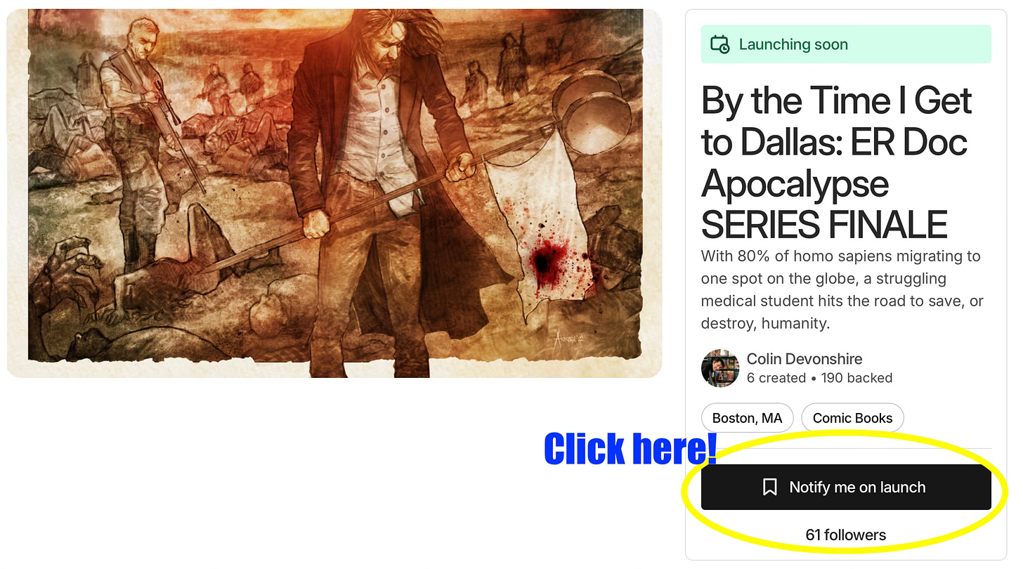
(BTW, we really want to build up our Project Followers on Kickstarter. Click on the linkand hit “Notify Me,” and when we hit 100 followers you’ll get an exclusive preview of the first seven completed pages of By the Time I Get to Dallas #5!)
So, how do we crush Kickstarter? By looking fantastic of course!
Projecting an Image
To win Kickstarter, you’ve got to have a great project image. That’s the 16:9 pic used as a thumbnail next the title on the Kickstarter project list, and also the feature image when blown up on the main campaign page.
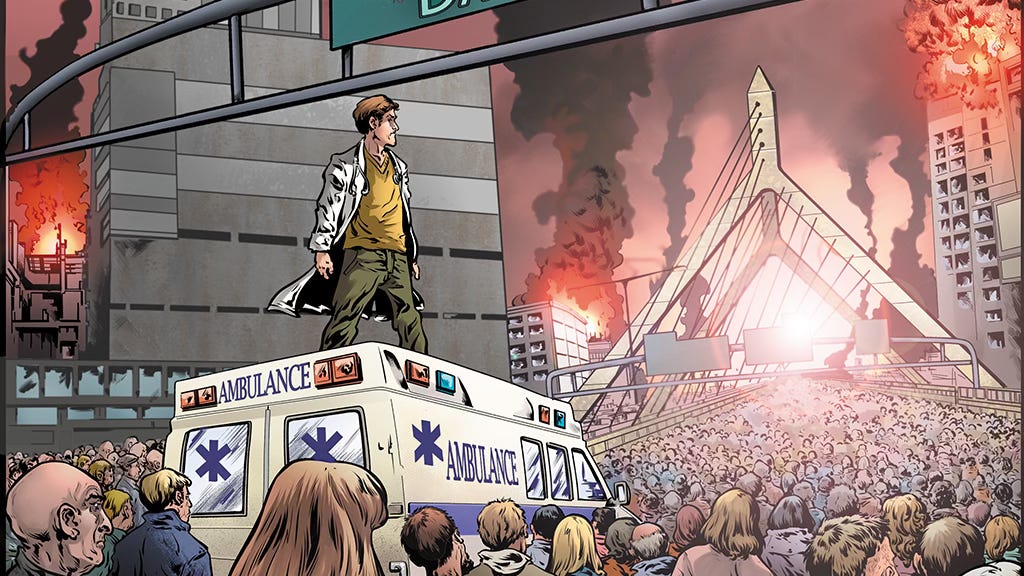
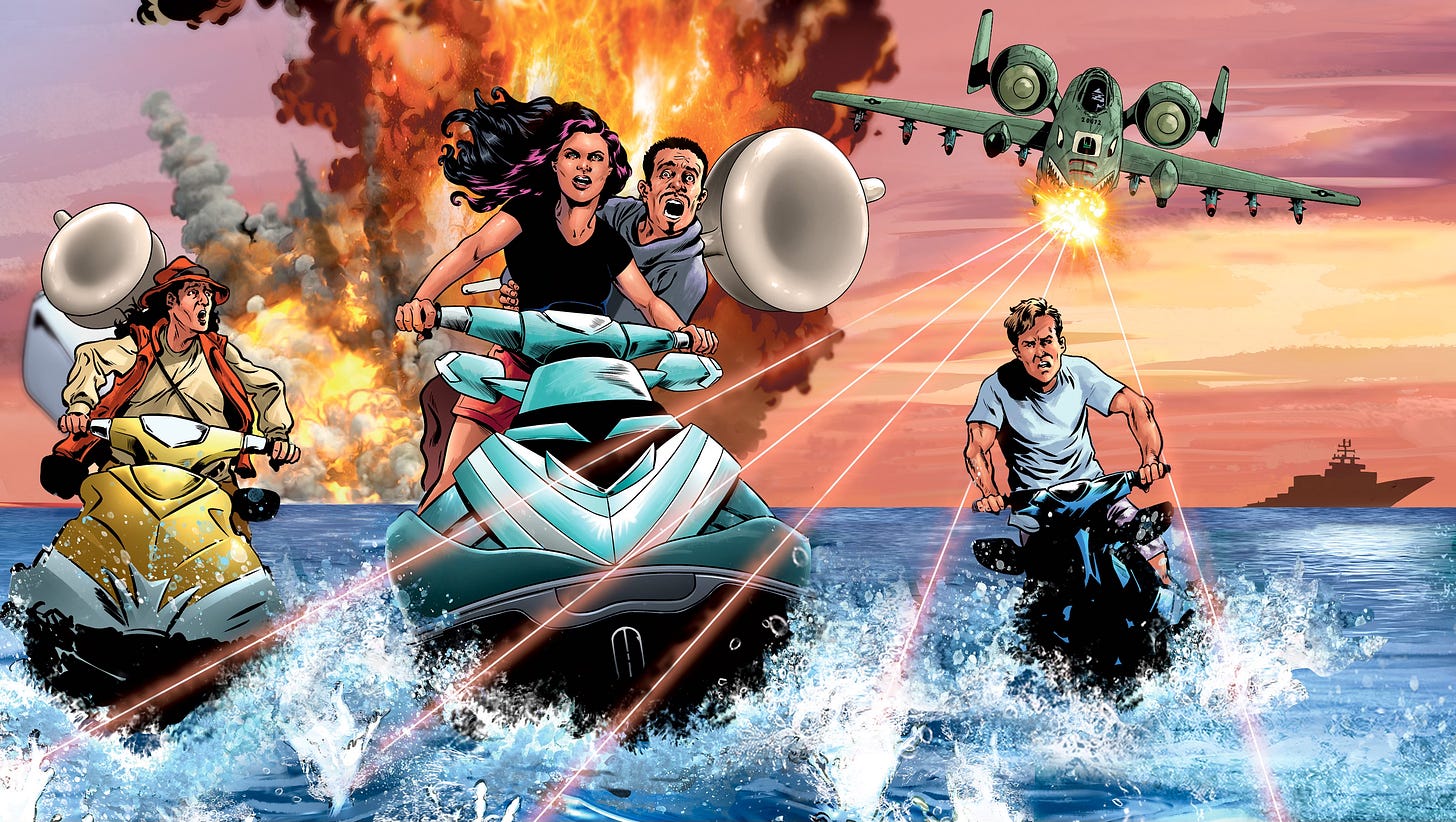
Here’s what I’ve used on prior launches:
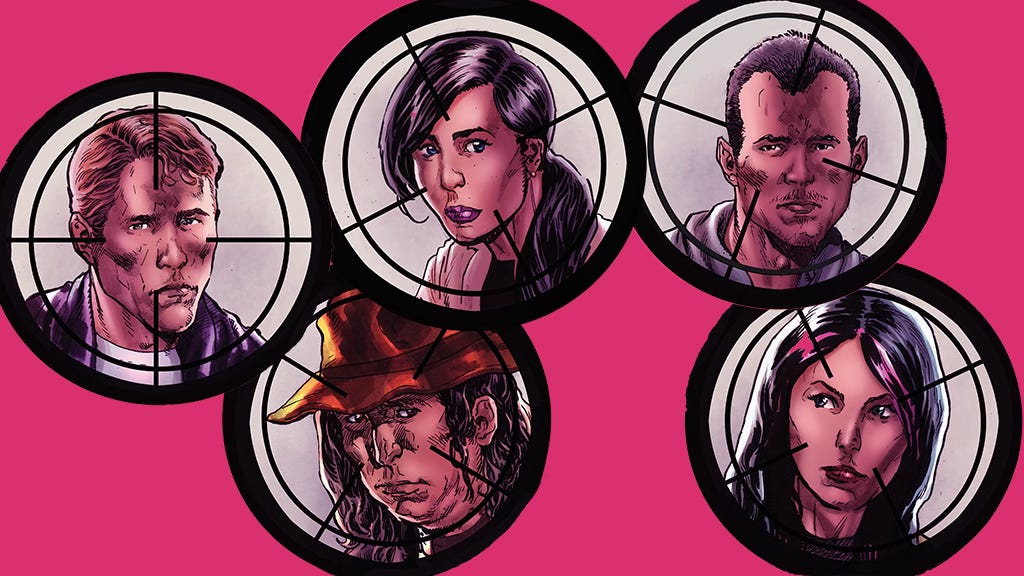
Right now on the prelaunch page I’m using stunning art by Erwin Arozza’s book 4 exclusive cover, but I want new art for the culmination of the project.
The project image has to do a ton of work:
- Catch the eye (great art, compelling composition)
- Instantly convey what kind of book this (medical apocalyptic adventure)
- Communicate what is unique about this book (written by an emergency doctor, character driven, heavy but comedic, a thinking reader’s zombie book)
- Pop when it’s small
- Astound when it’s big
- Have little if any text (distracts, doesn’t scan when small)
- Avoid gratuitous T&A (cause PitDoc Press don’t play that!)
Not easy to do! Many campaigns use art clipped from pages of the comic or cropped out of the comic cover and make it fit as best they can. That’s quick and cheap, but rarely does it work; the project image must be a 16:9 box, and the odds of having the right image at those dimensions in your existing artwork are small. I mostly got away with on my first one, but since then I’ve learned I’m best off composing exactly what I want and paying the artists to make it, or at least doing major art surgery to get a good image.
And that’s what we’re gonna do right now!
By the Time I Get To Dallas series penciller Ben Worrell and I have had some back and forth on image concepts. There are slight spoilers here. If you want to know nothing, skip this blog and chill.
If you’re still reading, this will reveal that, as you might expect, there is a climactic battle; and also, there will be a long-hinted-at hot air balloon and something we’re calling a Dark Tower.
Project Image Elements to Consider:
- Our heroes, found family
- Hint at what we find at Ground Zero
- Hint at climactic battle
- Dark Tower?
- Balloon?
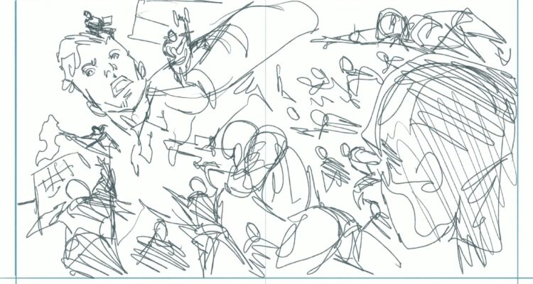
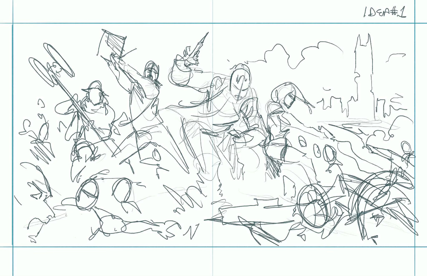
Concept 1: Heroes Surrounded. Heroes in group battle pose: Goose swinging the EM sensor pole, Anna using a taser, Rudy wielding a syringe, Rex swinging his laptop. Surrounded by militia and Travelers, everyone fighting; could include Dark Tower, balloon, militia vehicles, drones, flaming gas tanker truck. A nerd’s Mad Max.
Here is the sketch Ben did in response:
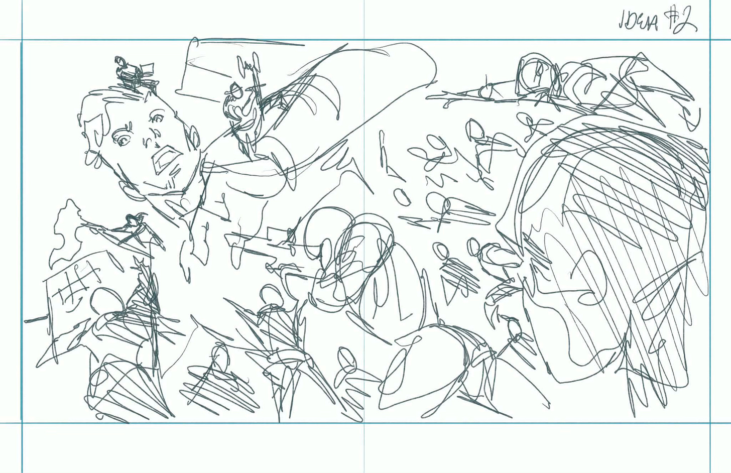
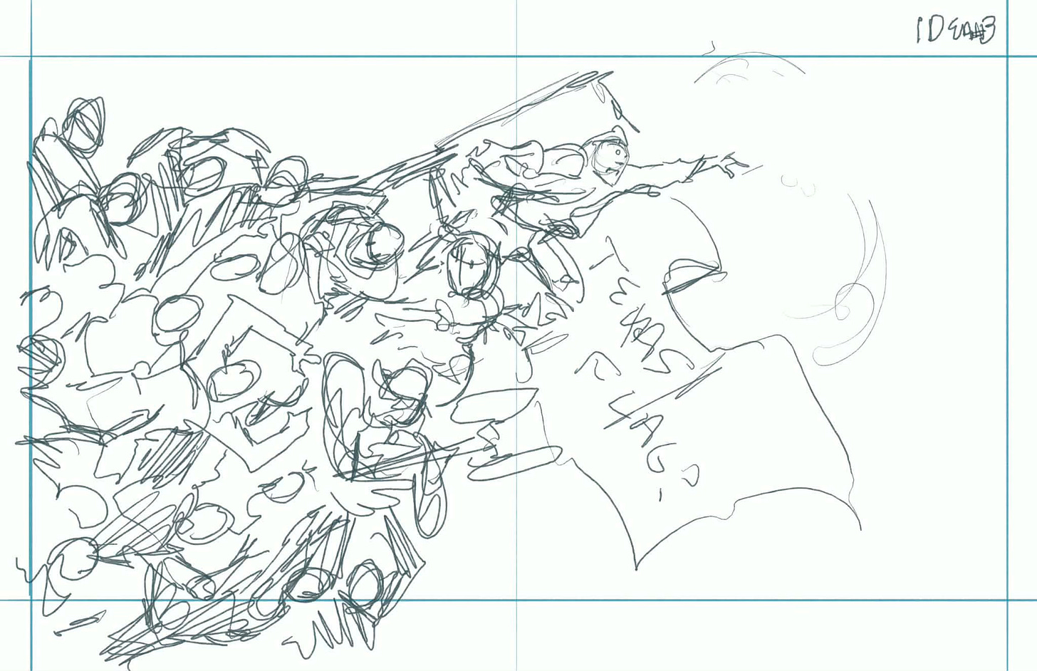
But he included two more concepts as well!
Concept 2: Gulliver’s Travels. Giant Rudy is beset by little militia, Travelers, etc. and defended by his friends on his shoulders.
Concept 3: Human Anthill. Rudy at the top, reaching for daylight and an American flag or Texas flag waving in the background.
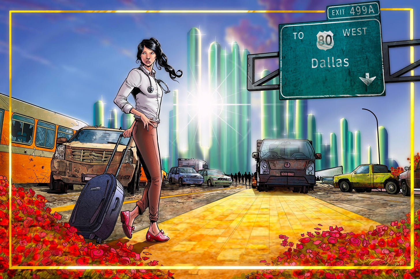
Nice! I love how Ben surprises me with concepts I never would have thought of, like last issue’s Wizard of Oz postcard:
So, what do you think? We’ve got three exciting ideas to start with. Which do you like? How would you change them? Got a better idea? I want to know!
Next time you’ll see what we come up with.
Thanks team!
Colin